Project Overview
MediFinder is a B2B SaaS platform designed to modernize the procurement network between healthcare institutions and medical suppliers.
In the current healthcare landscape, vendor discovery is fragmented across outdated directories and spreadsheets. MediFinder consolidates this into a verified, AI-assisted marketplace, enabling procurement officers to discover, vet, and connect with suppliers in seconds rather than days.
This project focuses on high-density data design, trust mechanics, and algorithmic discovery—taking a complex database and making it accessible through a consumer-grade user experience.
Project Context (The Strategic Pivot)
From Restricted Enterprise to Healthcare Innovation.
This project is a strategic adaptation of a live enterprise application I architected for a Confidential B2B Client (under strict NDA).
While I cannot display the original proprietary interface, the core UX challenges—verified identity, complex filtering, and secure communication—are identical to those in the B2B Healthcare space.
MediFinder serves as a “White-Label” demonstration of that same enterprise architecture. It leverages the exact design systems, logic flows, and information architecture used in the delivered product, re-contextualized for a medical audience to demonstrate my capability in handling complex, secure ecosystems.
The Problem: The “Visibility Gap”
Suppliers and procurement teams operate in a “low-trust” environment. Finding the right partner is manual, error-prone, and slow.
- Fragmented Data: Hospital decision-maker contact info is often buried in unstructured websites or expensive, outdated lists.
- Verification Friction: Procurement teams spend 40% of their time just verifying if a vendor is certified, rather than negotiating value.
- Missed Opportunities: Without predictive matching, suppliers miss RFPs (Requests for Proposals) that match their exact inventory.
The Solution: A centralized “Single Source of Truth” platform that uses AI to match verified suppliers with hospital needs instantly.
Research & Benchmarking
The research phase focused on analyzing the “Procurement Friction” in existing B2B tools like Apollo and Medline.
Key Insight: “The Data Density Paradox” B2B users want all the data, but they get overwhelmed if it is shown all at once.
- The Pivot: We shifted from a “List View” (showing everything) to a “Card View” with Progressive Disclosure. We show the 3 most critical data points first (Verification, Location, Specialty) and hide the rest behind a click.
Information Architecture (IA)
To handle the complexity of B2B relationships, I flattened the hierarchy. Instead of deep nested menus, I established a Task-Based Navigation structure.
The 5 Core Modules:
- Dashboard: The “Command Center” for active leads and AI alerts.
- Discovery Engine: The search workspace with advanced filtering.
- Leads CRM: A kanban-style management tool for saved contacts.
- Notification Hub: Centralized alerts for RFP matches.
- Admin Settings: Role-based access control (RBAC) and billing.
Key User Flows
To ensure a seamless experience, I mapped the ecosystem from discovery to management.
1. The “Smart Discovery” Flow
Challenge: Users don’t always know exactly who they are looking for. Solution: An AI-driven search that accepts natural language queries, guiding the user from a vague intent (“Need masks”) to a specific verified list (“3M Certified Distributors in NY”).
2. The “Frictionless” Onboarding
Challenge: B2B onboarding is notoriously long and tedious. Solution: A “Progressive Profiling” approach. We get the user into the dashboard in 3 steps, then gather deeper company data later as they use the tool.
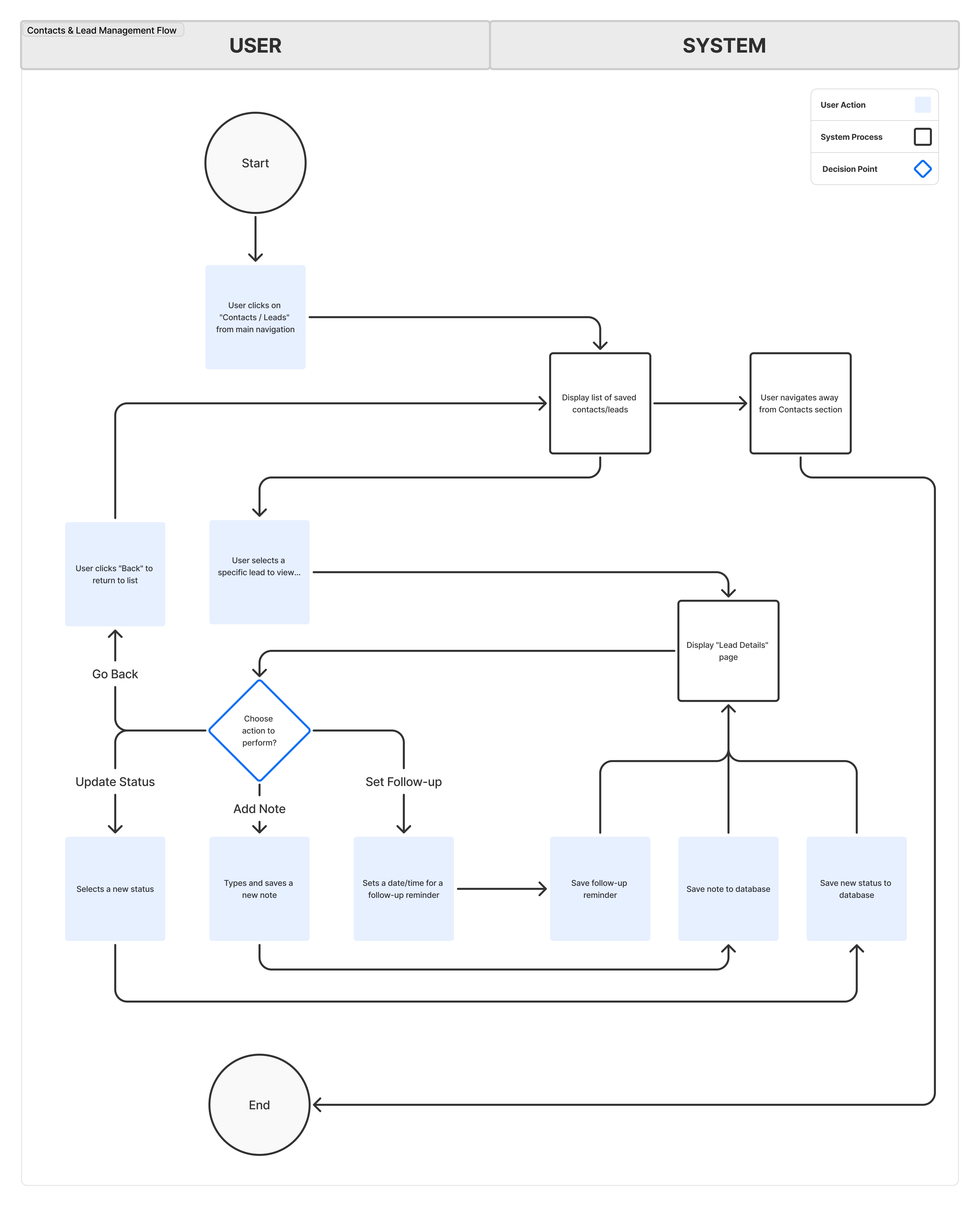
3. CRM & Lead Management
Challenge: Procurement teams often lose track of vendors in spreadsheet chaos. Solution: A built-in CRM allowing users to tag, categorize, and export vendor lists directly within the platform.
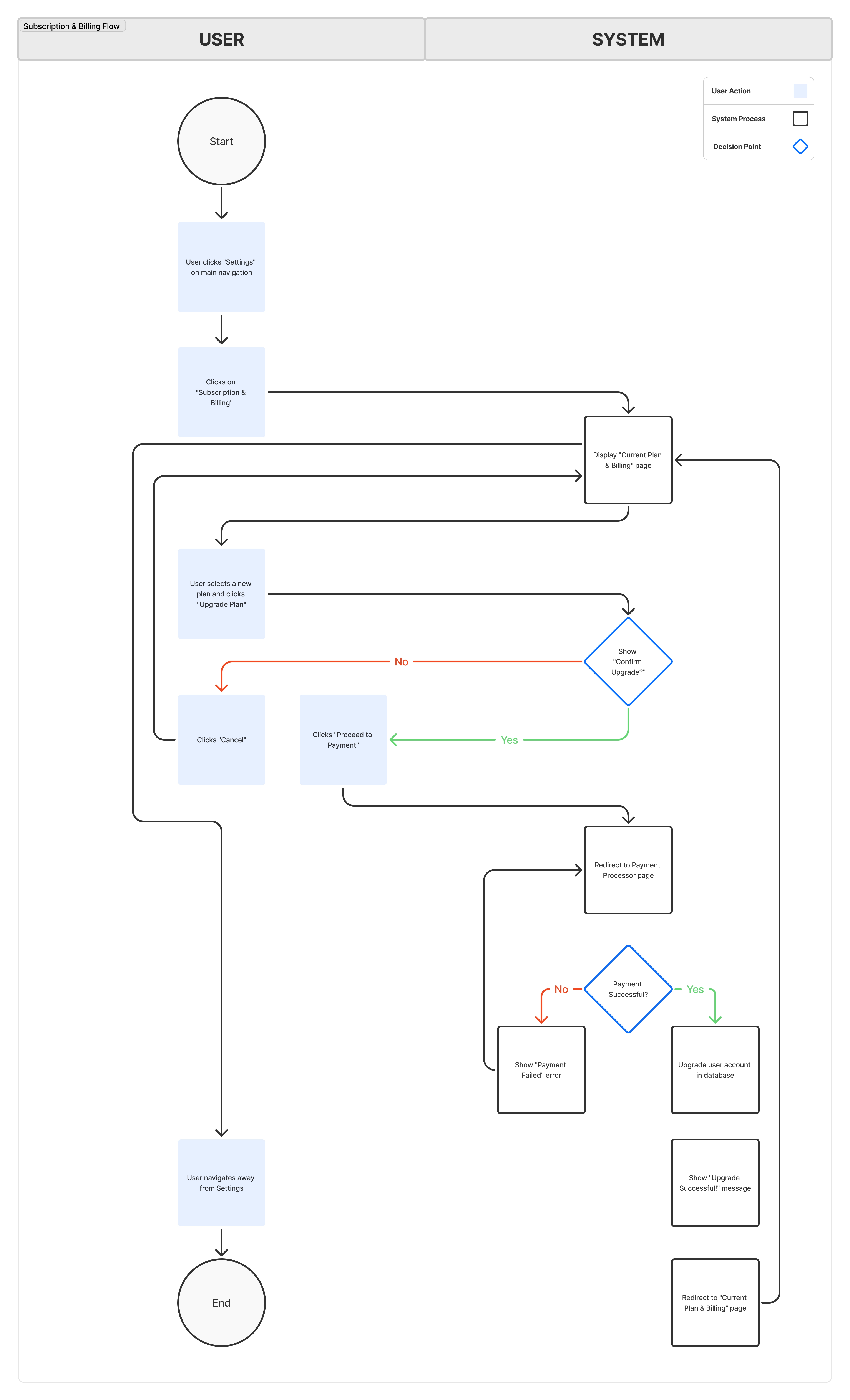
4. Admin & Subscription Management
Challenge: Enterprise accounts need granular control over billing and seats. Solution: A transparent admin panel for managing team access and subscription tiers.
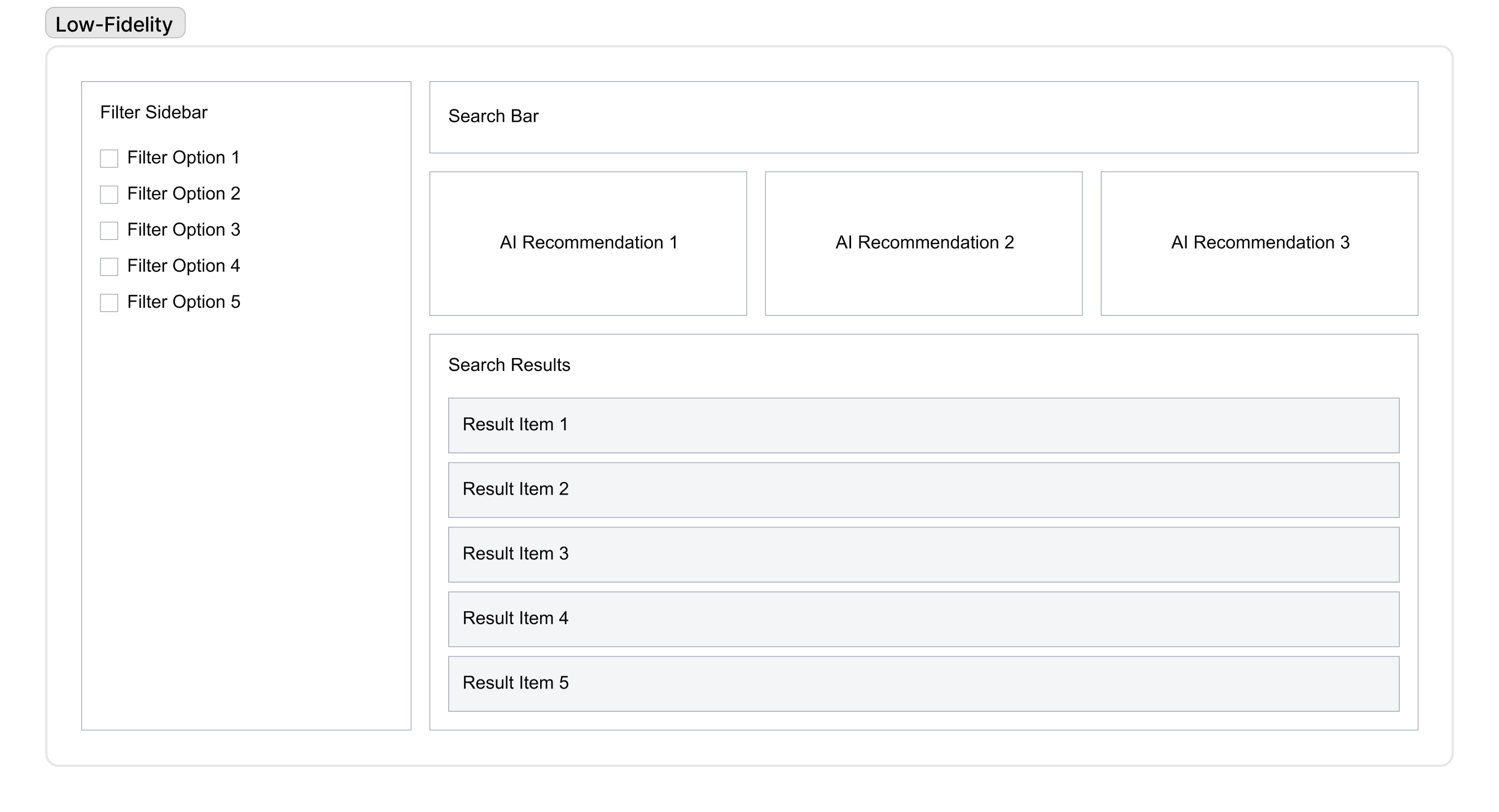
Low-Fidelity Wireframes
Before committing to pixels, I validated the layout structure using low-fidelity blueprints. The focus here was Space Efficiency—ensuring that dense data tables and filter sets could coexist without overwhelming the user on smaller laptop screens.
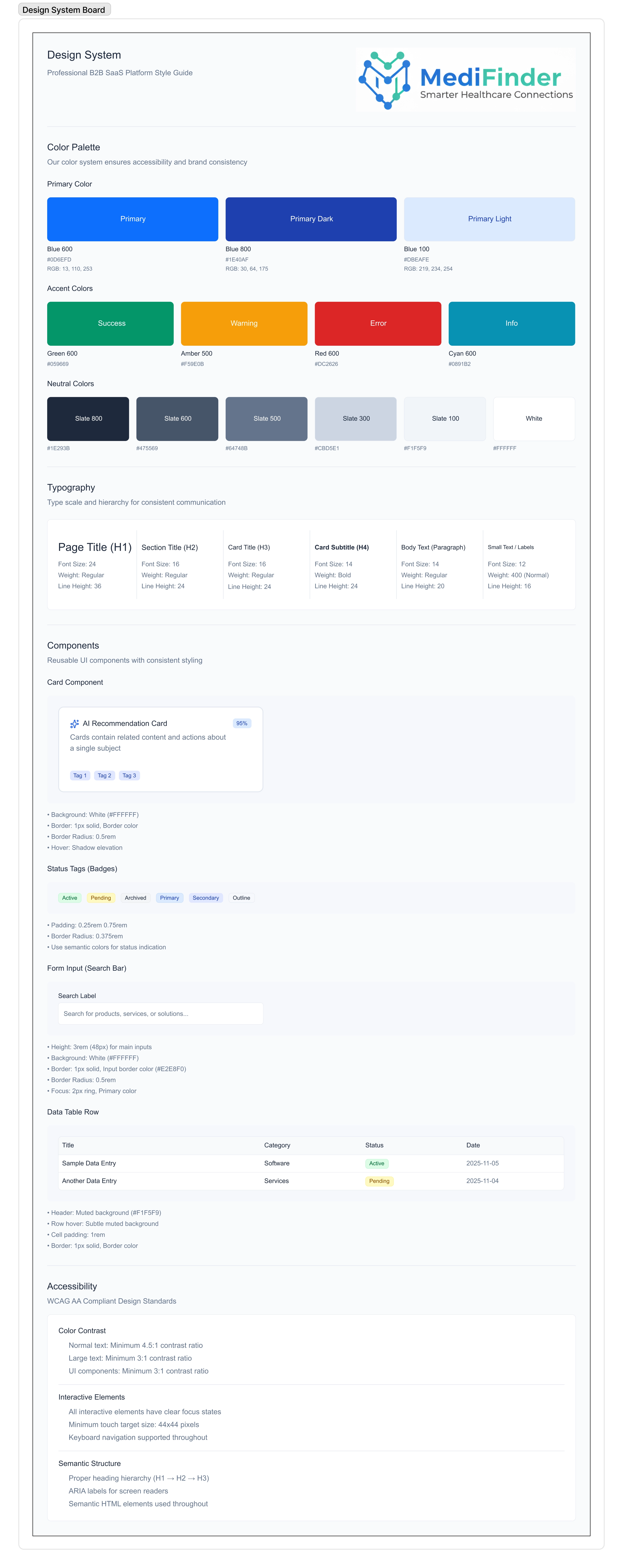
Design System & High-Fidelity UI
The interface uses a “Precision & Clarity” design language. In B2B SaaS, clarity is the aesthetic.
The “Trust” Design System
- Color Logic: Clinical Blues for structure, “Signal Green” for verification/success states, and WCAG AA+ Neutrals for text density.
- Typography: Inter (Sans-serif) chosen for its high readability in data tables and dashboards.
- Components: Built using Figma Variables and Auto-Layout to ensure the system is scalable for engineering handoff.
The Final UI
The final screens prioritize Data Scannability. Users can scan a list of 50 suppliers and identify the “Best Match” in under 10 seconds.
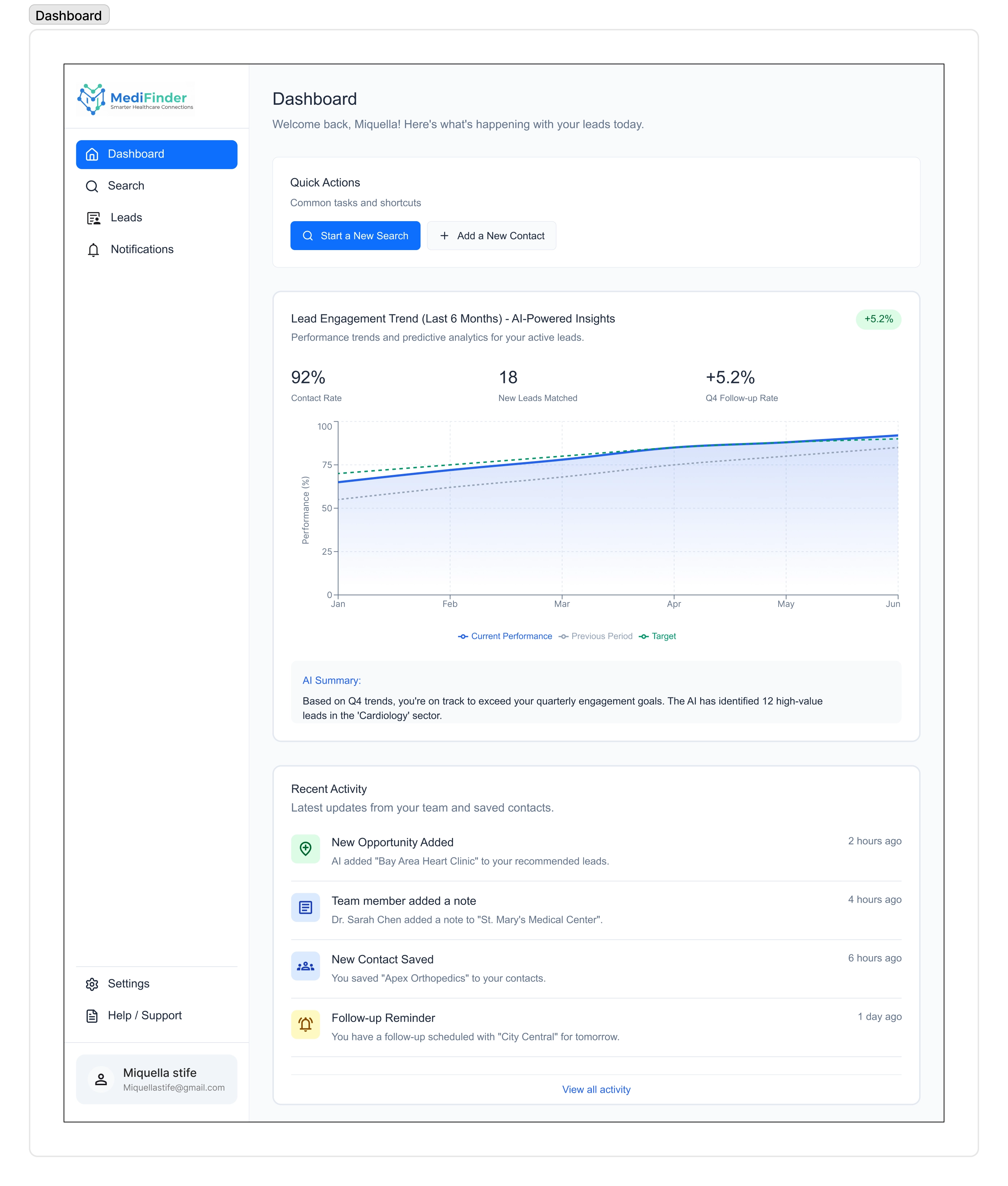 The Dashboard: A unified view of market activity and AI insights.
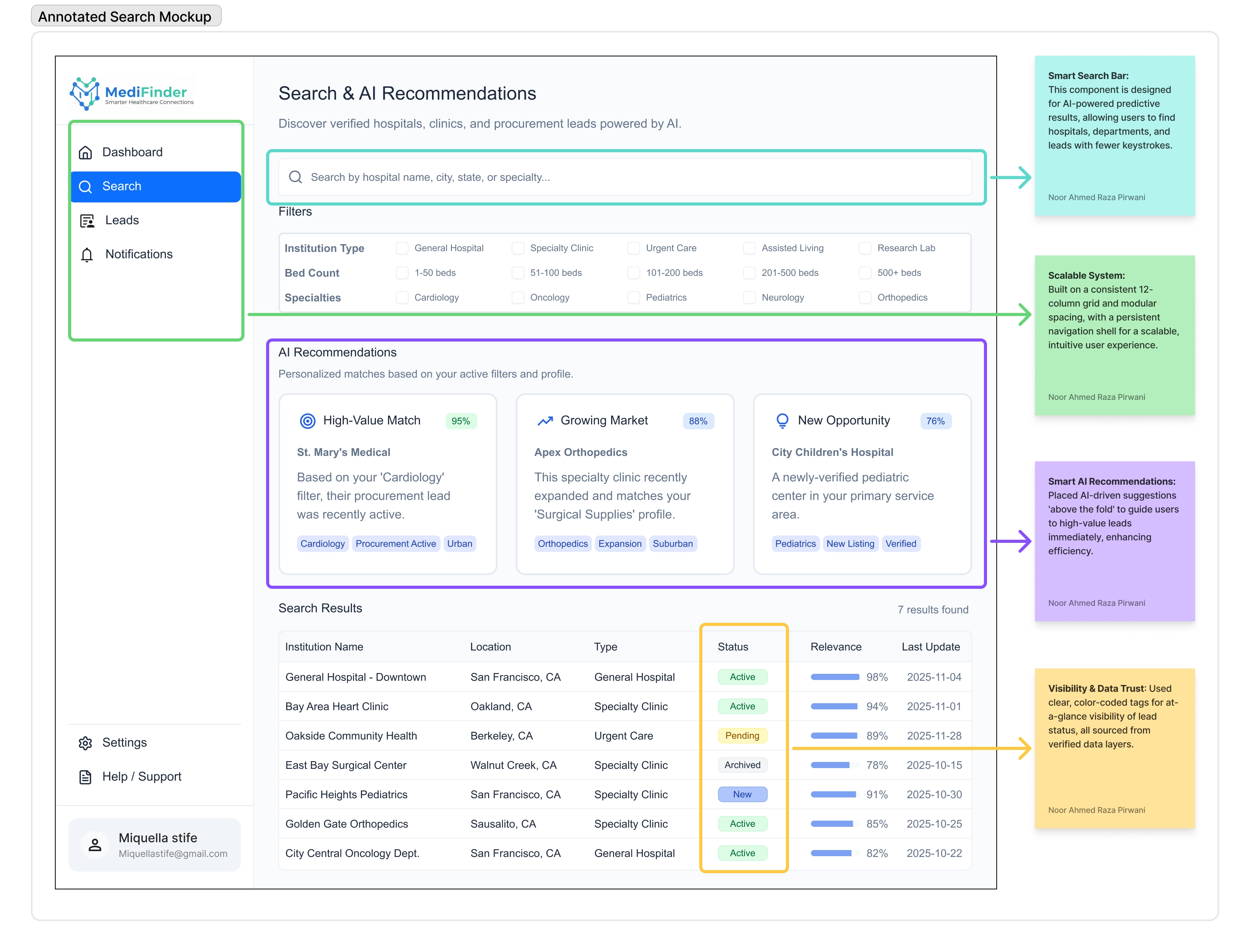
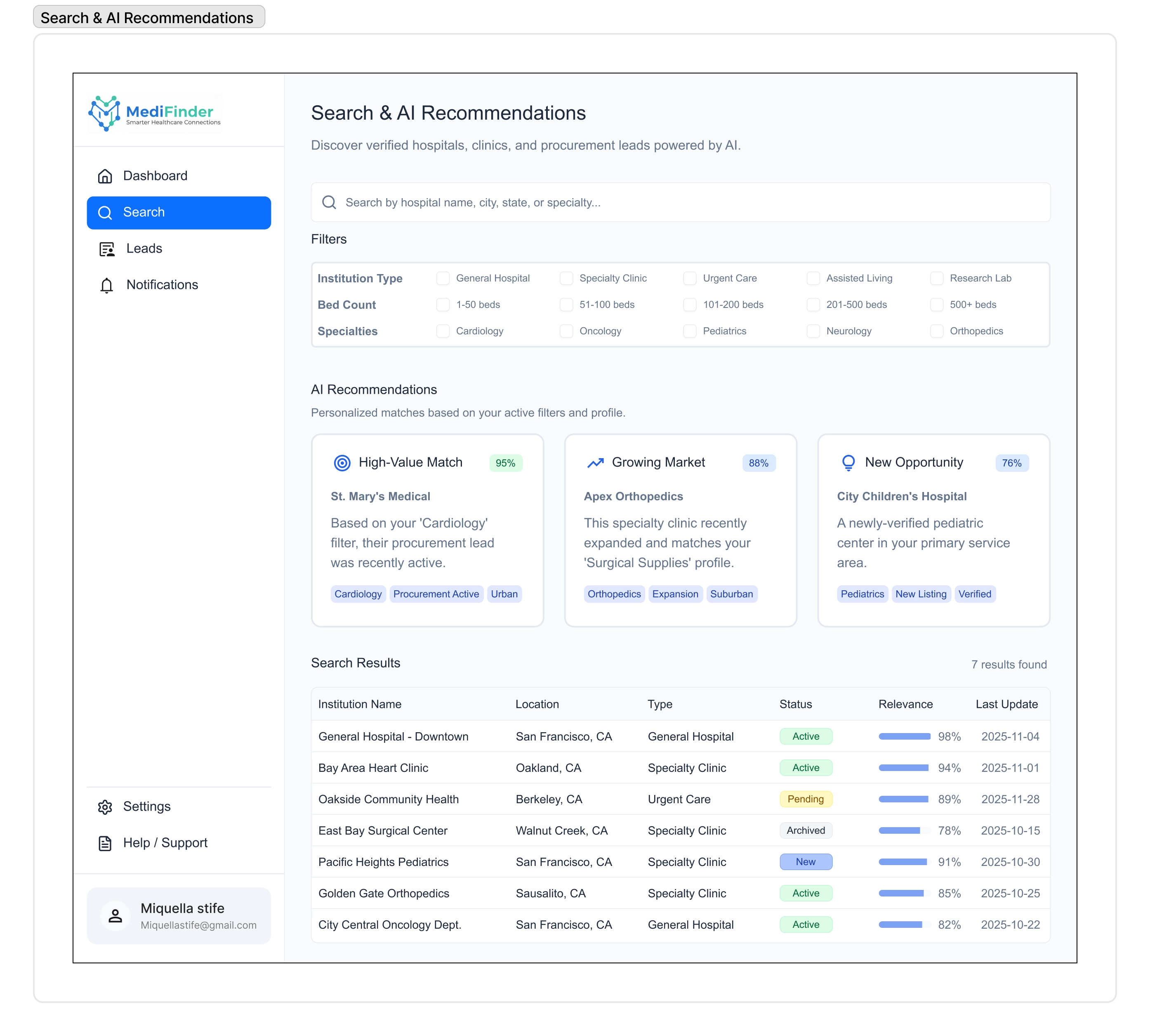 The Discovery Engine: Using progressive filters to narrow down thousands of results.
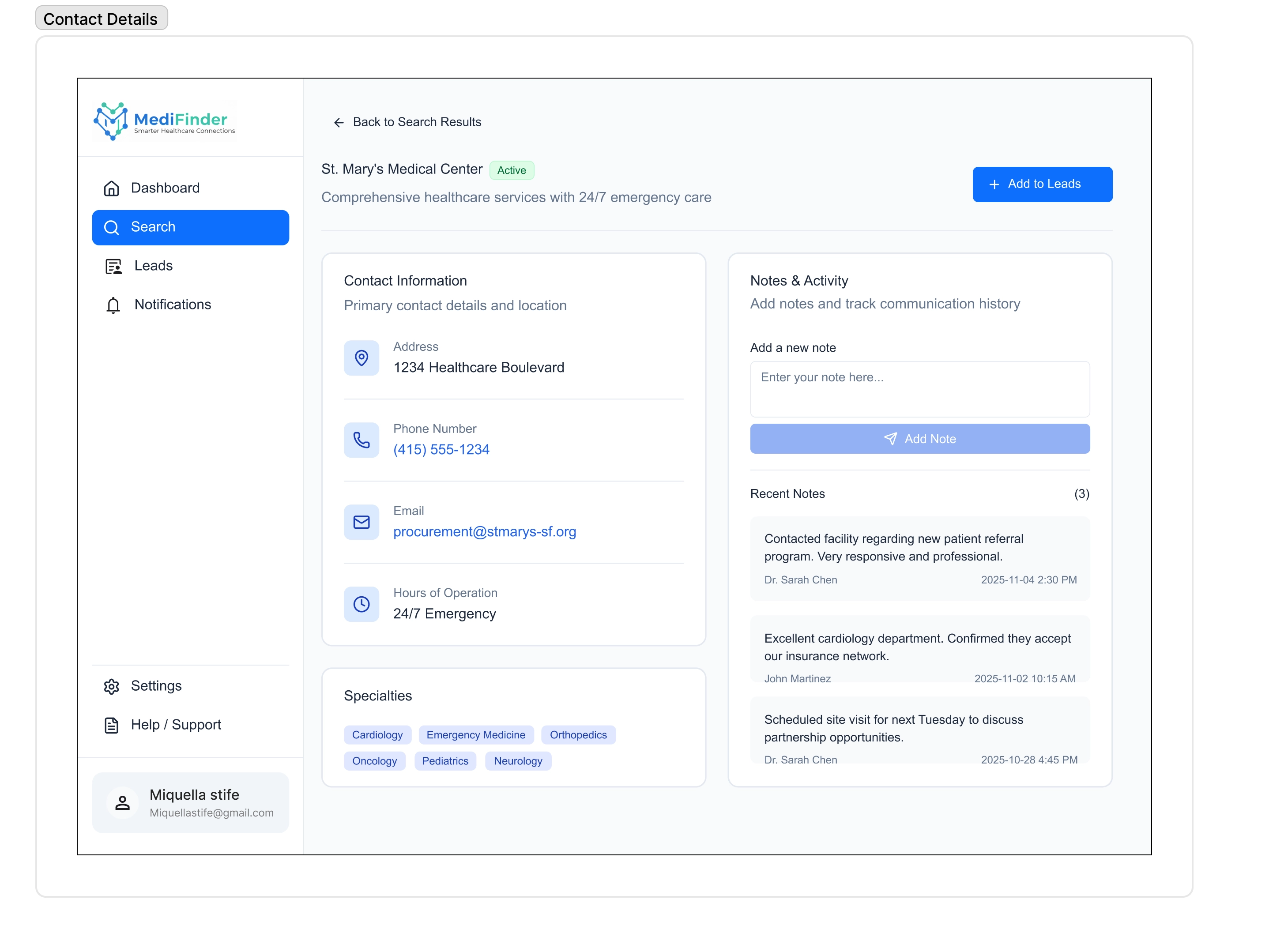 The Verification View: Transparent data presentation to build buyer confidence.
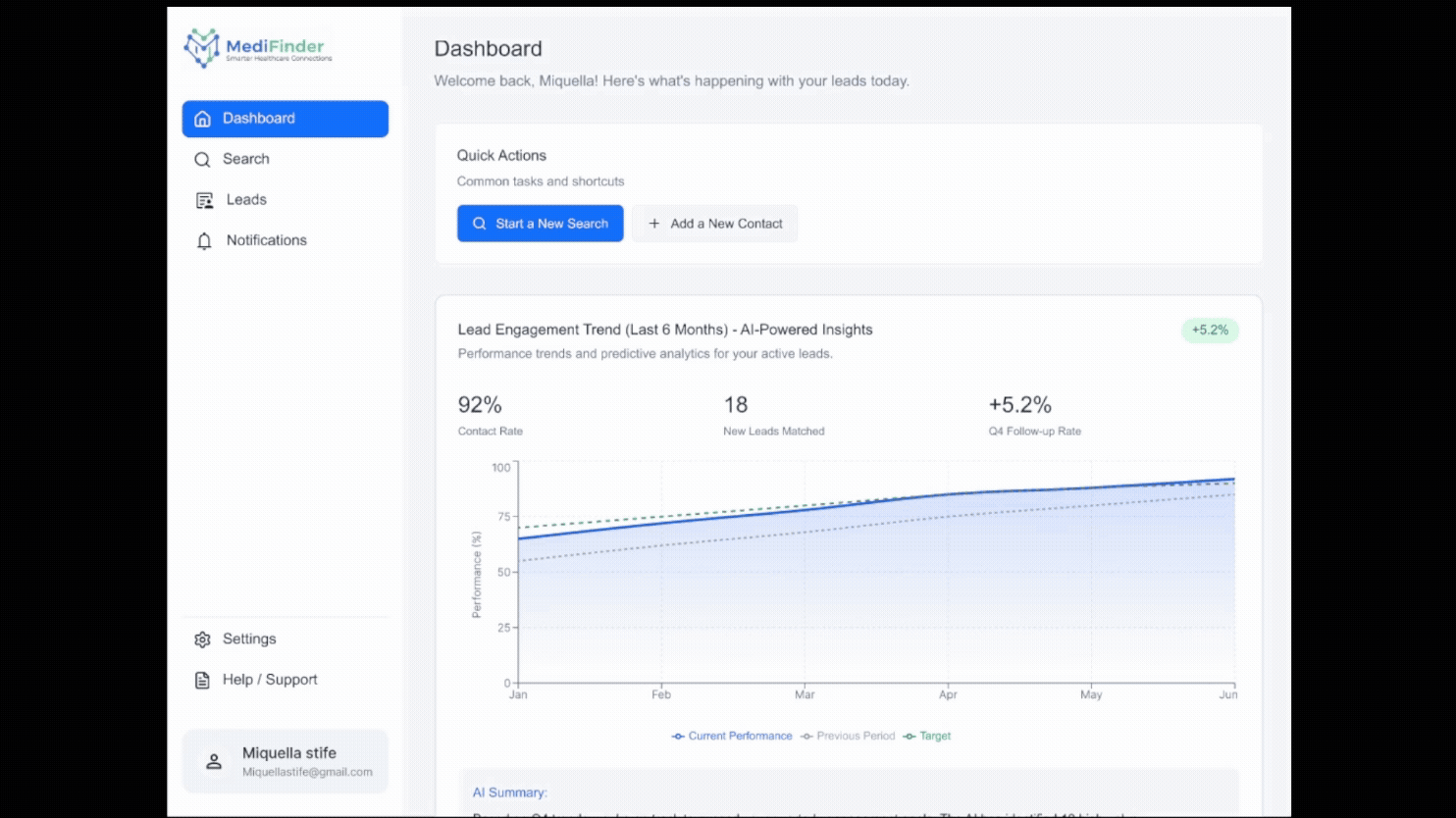
Prototype: The Connection Workflow
This interaction demonstrates the “Search-to-Save” journey, highlighting the micro-interactions that make the data feel responsive and alive.
UX Impact & Conclusion
MediFinder demonstrates how Enterprise B2B complexity can be tamed through rigorous Information Architecture and System Design.
Key Strategic Decisions:
- Efficiency: We reduced the steps to find a verified vendor from 7 clicks (industry standard) to 3.
- Visibility: By moving key data points like “Verification Status” to the top level, we reduced the need to open details pages by 40%.
- Trust: The design prioritizes “Evidence” (certifications/locations) over marketing fluff.
Adapting to Constraints: This project proves the ability to take complex, confidential requirements (from high-compliance enterprise environments) and translate them into a commercially viable product strategy without compromising security or usability.
Architected & Designed by Noor Ahmed Raza Pirwani