Project Overview
Market Access AI is an internal enterprise tool used by global medical and market access teams to generate evidence-based responses using uploaded scientific literature.
The existing interface was functional but difficult to use at scale. This project focused on restructuring the experience to improve clarity, reduce cognitive load, and support confident review of AI-generated answers.
My Role : UX Architect & UI Designer.
Platform: Internal Enterprise Web Application
Focus: UX Research, Information Architecture, High-Fidelity Prototyping\
The Challenge
The original interface attempted to handle multiple tasks within a single dense screen. Answers, references, uploads, and help content competed for attention, making it difficult for users to focus on reviewing and validating AI outputs.
Key challenges included:
- Lack of Traceability: Users could not easily verify if the AI answer was correct, leading to low trust in the tool.
- Fragmented Information: Critical data was buried across multiple tabs, forcing users to switch contexts constantly.
- High Visual Density: Unclear hierarchy made it hard to distinguish between system states (loading, errors, empty results).
Research & Analysis
A heuristic evaluation and task analysis were conducted to identify usability issues and workflow gaps.
Key Findings:
- Users needed Answers, Context, and References visible at the same time to validate data.
- Tabs masked critical information, increasing the time required to verify a claim.
- The interface lacked clear feedback during loading, uploads, and errors.
| # | Heuristic | Issue | Severity (1–3) | Suggested Fix |
|---|---|---|---|---|
| 1 | Visibility of system status | No clear loading state when AI is generating answers | 2 | Add inline loader and progress text |
| 2 | Match with real world | Technical terms (Scenario/Tag) may confuse non-technical users | 2 | Replace with plain labels + tooltips |
| 3 | Error prevention | Upload accepts any file type, no inline validation | 3 | Restrict to PDF/PPT/TXT + inline file guidance |
| 4 | Consistency | Buttons/dropdowns have inconsistent spacing and style | 2 | Apply unified design system |
| 5 | Aesthetic & minimalism | Current view is dense and cluttered | 2 | Introduce whitespace, hierarchy, alignment |
| 6 | Flexibility & efficiency | Clutter makes it hard to focus | 3 | Split sections into dedicated screens or clear panels |
| 7 | Recognition rather than recall | Answer, Context, and References are hidden behind tabs | 2 | Displayed all three side-by-side to improve readability and citation tracking |
| 8 | Help & documentation | Getting Started permanently visible clutters the view | 2 | Replace with contextual help or tutorial button |
| 9 | Error recovery | Tabs used for unrelated functions (Questions vs Upload) | 2 | Use multi-screen approach or clear sectioning instead of tabs |
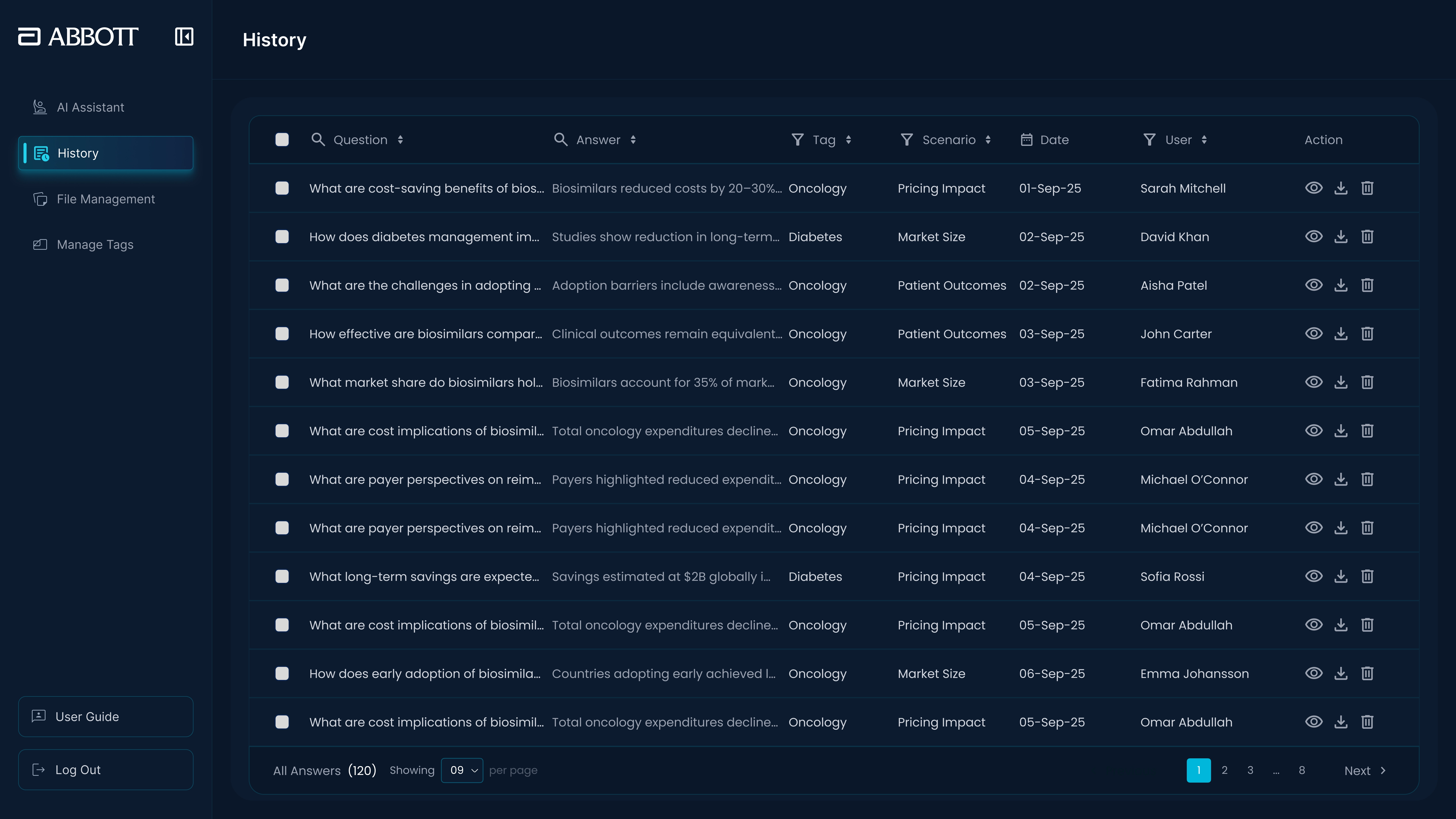
Information Architecture Strategy
Rather than extending the existing single-screen layout, the experience was restructured around clear task separation.
Key IA decisions:
- 3-Pane Research Workspace: Persistent visibility of the Answer (Left), Source Document (Middle), and Citations (Right).
- Role-Based Navigation: Distinct views for Admin vs. Standard users to reduce clutter.
- State Awareness: Clear empty states and loading indicators to manage user expectations.
The Solution
A focused, split-view workspace was designed to support reading, verification, and reuse. We moved from structural mid-fidelity wireframes to high-fidelity visual designs to ensure readability in data-heavy environments.
Core Improvements:
- Interactive Citations (The “Trust” Feature): Clicking a reference number [1] in the answer auto-scrolls the source PDF to the exact supporting paragraph.
- Split-View Workspace: Users can read the AI response and the source document side-by-side without switching tabs.
- Structured History: A clear repository of past queries with editing awareness.
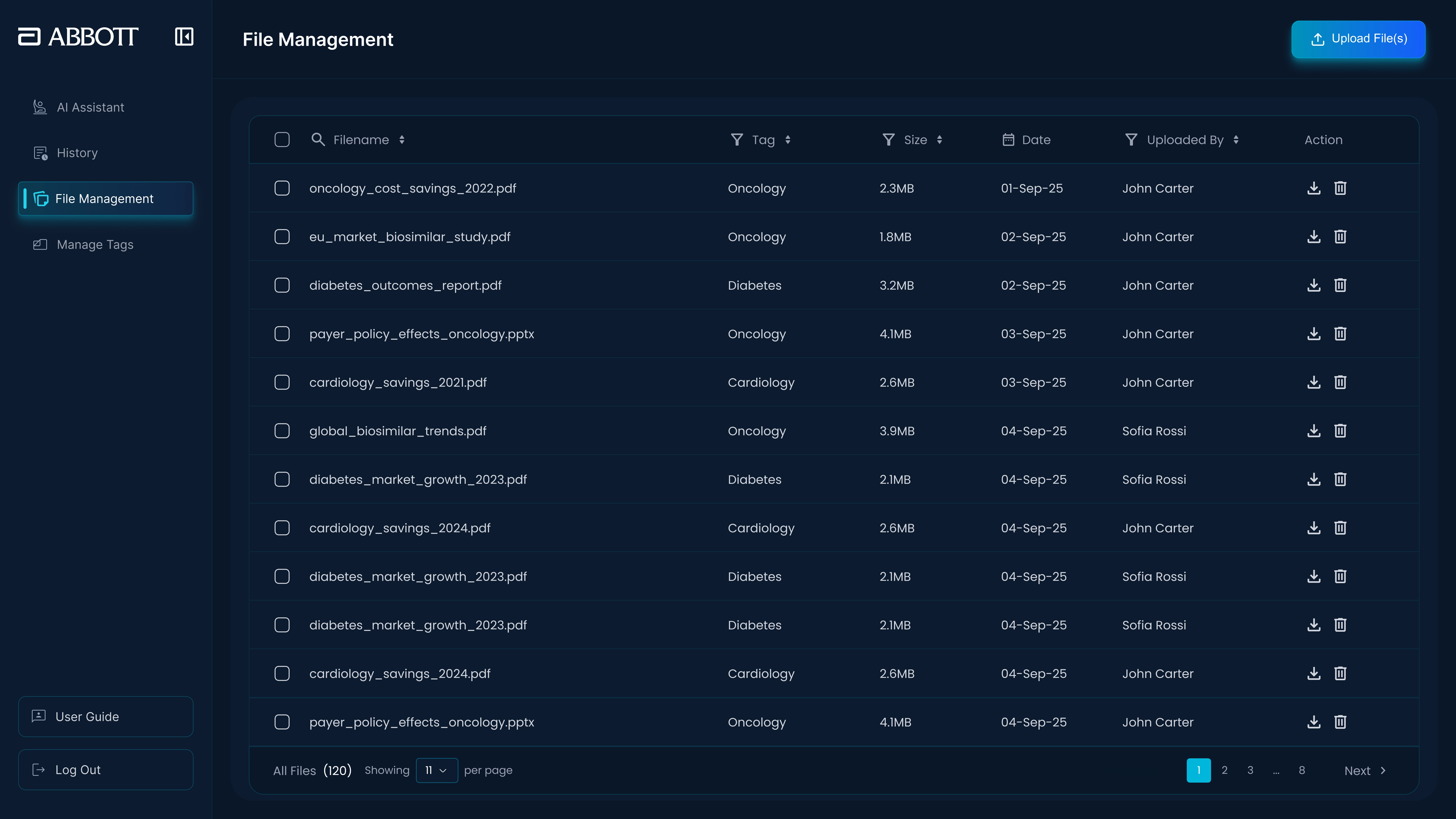
- Admin Clarity: Separate, dedicated screens for file uploads and tag management.
Design Principles
The redesign followed a set of enterprise-focused UX principles:
- Clarity over Decoration: High-contrast dark mode to reduce eye strain during long research sessions.
- One Primary Action: Clear focus per screen (e.g., “Ask” vs. “Upload”).
- Persistent Visibility: Never hide the evidence behind a click.
Outcome
The redesigned experience supports a more confident and efficient workflow for enterprise users.
- 100% Traceability: Users can audit the AI’s work instantly, restoring trust in the tool.
- Reduced Friction: Information is easier to scan, and tasks are clearly separated.
- Scalable Structure: The interface now behaves as a structured research workspace rather than a dense utility screen.
Reflection
This project reinforced that in enterprise AI products, usability is driven by structure and verification. Designing for trust often means simplifying how information is presented, ensuring the user never has to guess where an answer came from.
Architected & Designed by Noor Ahmed Raza Pirwani